S&P Global
Unifying seven web properties into a single experience with a scalable design system
Overview
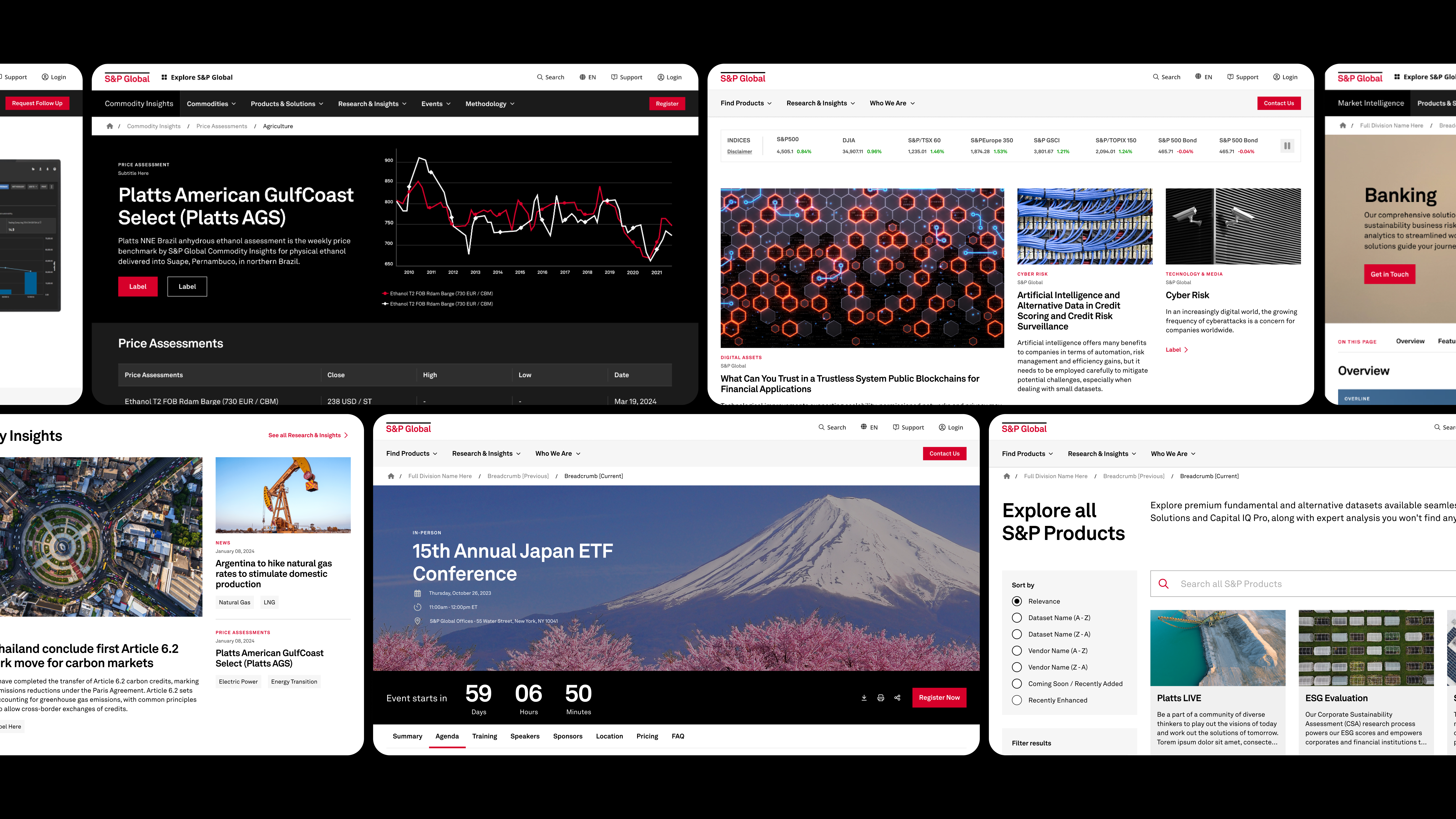
Unifying seven fragmented web properties into one S&P Global branded web experience
To support S&P Global’s CMS consolidation, I led the UX strategy and execution to transform seven fragmented web properties—including the corporate site and six divisions—into a single experience, unified under the S&P Global brand. We focused on creating a scalable design system and page templates that reflected S&P’s global value proposition while streamlining the path from content discovery to lead generation.
- Team
- Creative director, product manager, 2 UXRs, 2 design leads, 4 designers
- Duration
- Six months, full time
- Role
- Design Lead — design system & global header navigation
Objectives
The unification focused on a reimagined global header navigation, template structure, and design system
Reevaluate and redesign the information architecture and primary site navigation bar across S&P Global web properties to align with user expectations.
Unify the fragmented user experience of legacy CMS systems into a core set of AEM components that help accelerate content publishing.
Build a set of AEM templates that create consistent user experiences for discovering content, lead generation, and customer conversion.
Approach
Site consolidation began with a dual-track approach: auditing templates top-down, consolidating components bottom-up
One of the core challenges for the design team was streamlining the thousands of existing components and templates spread across six divisional websites—without compromising the functionality and flexibility content authors relied on. To tackle this, we adopted a dual-track strategy: half of our team focused on grouping legacy templates by the user needs they addressed to find overlapping functions and similar structures; the other half focused on examining all existing components, flagging duplicates and near-duplicates (including 23 different card variations!).
The outcome was a refined list of core components designed to ensure visual consistency, improve reusability, and optimize development efforts. Alongside this, we developed a set of standardized templates to encourage consistent content patterns, improving both discoverability and lead conversion across the sites.
Research
Three research phases, 77 participants: exploring the mental models of S&P’s customers
The unique strategic importance and complexity of the site information architecture and header navigation required a more focused research effort. The three research phases sought to understand user expectations and validate design solutions with customers and prospects across all seven divisions.
Taking the pulse of user expectations
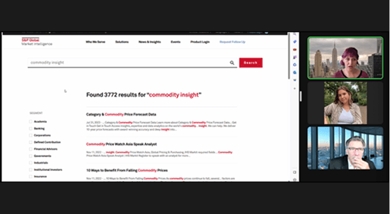
Exploratory research with 15 participants to understand mental models, expectations, and baseline navigation usability across all divisions.
Competitor Audit
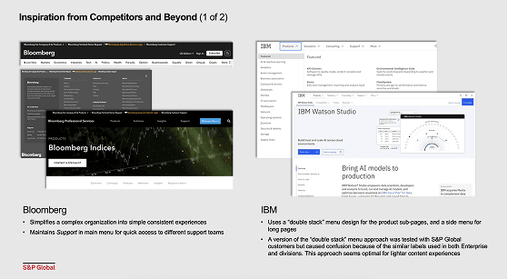
Audited financial services competitors to understand product taxonomy and how brands distinguish between parent and sub-brand identities on the web.
Evaluative Testing
A ~20-minute self-directed study with 62 participants across all divisions, testing navigational tasks and surveying preferences across the top prototype concepts.
Challenges
When progress stalled, we stepped back to align on a shared vision for the content discovery journey
A few weeks into the project, our team had difficulty aligning divisional stakeholders toward a unified approach. Each division had specific requirements and was deeply invested in existing content structures. When multiple design reviews either stalled or lost ground, we stepped back to diagnose the issue.
Through conversations with marketing leads, we discovered that part of the conflict stemmed from having no shared cross-divisional vision for content discovery on the web. Taking a week to align on a high-level user journey—how different customers enter the site, discover content, and transition into sales leads—brought shared goals and perspective that re-energized design reviews and facilitated consensus.
We also enhanced our sprint process by introducing two preliminary sessions to align on template features, functionality, and purpose. The first session allowed content authors to showcase successful legacy templates and discuss pain points. In the second, we leveraged these insights to shape the new template’s structure and implementation.
Outcome
From 250 templates to 20: building and documenting an 80-component system
Design System
I led the delivery of 80 AEM components, each documented with three breakpoints, optional variations, interaction, and content authoring guidelines. This documentation served both as guidelines for development and for content authors and marketers as they transitioned to the new CMS.
Page Templates
The team delivered 20 AEM templates, consolidated from approximately 250 templates from the legacy CMS. The streamlined set of templates provided a unified experience for content exploration, discovery, and engagement—and were used to migrate around 300,000 legacy pages to the new CMS.
Outcome
Three months of research into one global header
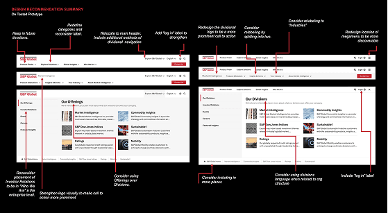
An overview of the navigation updates that were designed and developed after nearly three months of generative research, competitive analysis, and evaluative concept testing.
Impact
131% more page views, 21% more leads: impact in the first five months
Since the site launched, S&P has seen positive growth in site visitors, page views, and conversion of site visitors into sales leads. Below is a summary of the year-over-year changes in the first five months since launch.
- 131%YOY increase in page views
- 95%YOY increase in page visits
- 21%YOY increase in form completion
- 80AEM components delivered
Takeaways
Takeaways from the Journey
Always Consider the Tooling Gap
Having seen this project from initial brainstorm to final launch, I’m struck by how much distance can open up between a design system and its build platform, even when the end-user experience matches. At the end stages of our design process, when we began to see the developed Adobe templates, they didn’t always match the logic or structure of our design files. We caught this once authors started building pages and struggled to map our documentation to their actual workflow, so the design team reworked our documentation to mirror the AEM component structure directly. It solved the immediate problem, but cost weeks of design time. If I were running this again, I’d push to have AEM mapping reviews early in the project timeline, a standing checkpoint to catch drift between design and build components before content authors hit it, rather than after.
Design as “the long pole” in platform transitions
Structured design methods and the collaborative spirit of design sessions, like facilitated stakeholder alignment sessions, visioning exercises, and divergent thinking, proved especially valuable in a project where the complexity came less from the design itself and more from the organizational dynamics surrounding it. Having a repeatable process that created opportunities for cross business sector input helped build trust across divisions and the space for a unified web presence.