Project Meridian
A reimagined 401k enrollment experience for plan participants
Overview
A mid-market retirement services provider needed an experience that promoted good savings behavior
Project Meridian was a ground-up rebuild of the digital experience for plan participants, sponsors, and advisors at a Fortune 500 U.S. retirement provider. As B2C design lead, I led an international team of 10 through design and testing of the full participant experience, from enrollment through withdrawal.
This case study zooms into one piece of that redesign: enrollment, the moment where decision anxiety costs both the participant and the business the most. We focused on reducing complexity and decision anxiety at the point where participants face the critical decision of how much to save and where to invest, building simple tools that helped people see trade-offs clearly and make that decision with confidence.
The product is set to launch in Fall 2027.
*For confidentiality purposes, client name has been withheld.
- Client
- Fortune 500 US retirement services provider
- Team
- Creative director, 2 SMEs, 2 UXRs, 4 design leads, 20 designers
- Duration
- Five months, full time
- Role
- B2C design lead, overseeing the end-to-end digital journey for 401(k) plan participants—from enrollment through withdrawal. Managed an international team of 10 designers.
Challenge
Americans either “set it and forget it” or they never set it at all
Within the full redesign, one challenge stood out for its size and urgency: enrollment abandonment. Participants were leaving the enrollment flow before making a savings or investment election, with real costs to both their retirement outcomes and the business’s assets under administration.
That’s the pain point this case study walks through. It sat alongside other known pain points across the broader redesign but enrollment carried the clearest opportunity for near-term engagement and revenue impact, and the clearest line from research insight to shipped design.
Research
Two ways enrollment fails participants
Analytics on the existing site revealed the primary cause of enrollment abandonment was decision anxiety, with many users feeling unsure about their choices. A significant 47.5% of users indicated they needed more time to make a decision, while 25.3% reported requiring assistance. This struggle to decide was the leading factor in users abandoning the enrollment process.
These analytics were confirmed and deepened in a round of in depth interviews with 7 research participants 22–64 years old, all enrolled in an employer sponsored retirement plan. Many described themselves as overwhelmed or confused during key enrollment decision points, like decided how much to contribute or where to invest. Most participants expressed a desire for guidance through these enrollment decisions.
“I feel fairly confident, but there are attributes that I definitely could get help with in terms of an investment strategy that works for the stage that I’m currently in”
— Participant, 58
“As an overwhelmed new hire, I need additional support so I don’t fall through the cracks”
— Participant, 23
While mapping the plan enrollment customer journey with industry experts, our team identified another high-impact design opportunity: automatic enrollment, where employees are enrolled in their employer’s 401k unless they manually opt out. In 2021, 37.1% of plan participants were in plans with automatic enrollment, a number expected to rise. Despite this adoption, the digital experience for auto-enrolled participants has remained largely overlooked, often leaving participants with low savings rates and default investment vehicles—limiting their chances of building healthy retirement savings.
Simply put, our research sprint identified two fundamental insights for improving the enrollment experience: (1) simplify enrollment decisions and contextualize them for each participant’s individual circumstances, and (2) build a dedicated experience for auto-enrollees that lets them quickly understand their default elections and act on them, rather than leaving those decisions on autopilot by default.
UX Explorations
More context ≠ better decisions
We started the enrollment design phase with an eagerness to empower users with tools to understand their contributions impact on their long term future. Our first wave of enrollment designs threw every modeling tool we could build at the problem: dynamic charts, real-time projections, sliders for every variable a participant could tweak to watch their future balance shift.
It backfired. In internal testing and client reviews, 100% of testers reported feeling confused when shown these early wireframes. What we thought were powerful, personalized modeling tools instead heightened the analysis paralysis we were trying to design away.
Our next round of designs took inspiration from pricing pages instead: three simple contribution rate options, with one pre-selected based on the participant’s age and income. For most users, these three buckets gave them an easy mental model for their retirement savings, and the system recommendation helped them quickly anchor on a healthy savings rate. For those who wanted to go deeper, we offered the option to customize their contribution rate — surfacing a simplified savings-estimate range to keep that decision grounded, even without the full modeling toolkit.
Outcome
Fewer choices, better results
On the key decision how much to save for retirement, the experience offers three personalized contribution packages with one recommended based on the users age, income, savings, and retirement age. For the majority of users who prefer a guided and quick enrollment experience, the personalized contribution suggestions give them confidence in their decision making and anchors them to healthy savings behavior.
For the minority of users who want to customize their rate, the experience provides dynamic guidance on the impact of this selection on a user’s current payroll and future savings potential.
Outcome
Creating a decision point for auto-enrollees
Many employers are shifting to auto enrollment, meaning that employees will be automatically enrolled in their direction contribution plan should they take no action. Plan participants who auto-enroll are defaulted to a low contribute rate and a non-optimal investment strategy. Most auto-enroll experience today do very little to push participants toward customizing these elections. Our strategy was to define a new experience that took every opportunity to push participants to review their plan elections.
Handoff
Documentation for an offshore dev team
Development work was staggered from design by several months. As such, detailed component-level engineering specs and comprehensive user task flows were crucial to communicating the experience and ensuring fidelity to the experience design work completed by our team.
Impact
Enrollment was a crucial piece of a redesign for the entire participant experience. To give you a sense of the wider design effort, below are metrics which highlight the scale and impact of the entire redesign effort. If you would like to know more about any element of this project, please reach out.
Numbers are inclusive of work conducted across B2B and B2C tracks
- 230unique dev-ready screens delivered
- 52hours of moderated user interviews
- 4.8 / 5.0Customer Effort Score of the redesigned enrollment experience
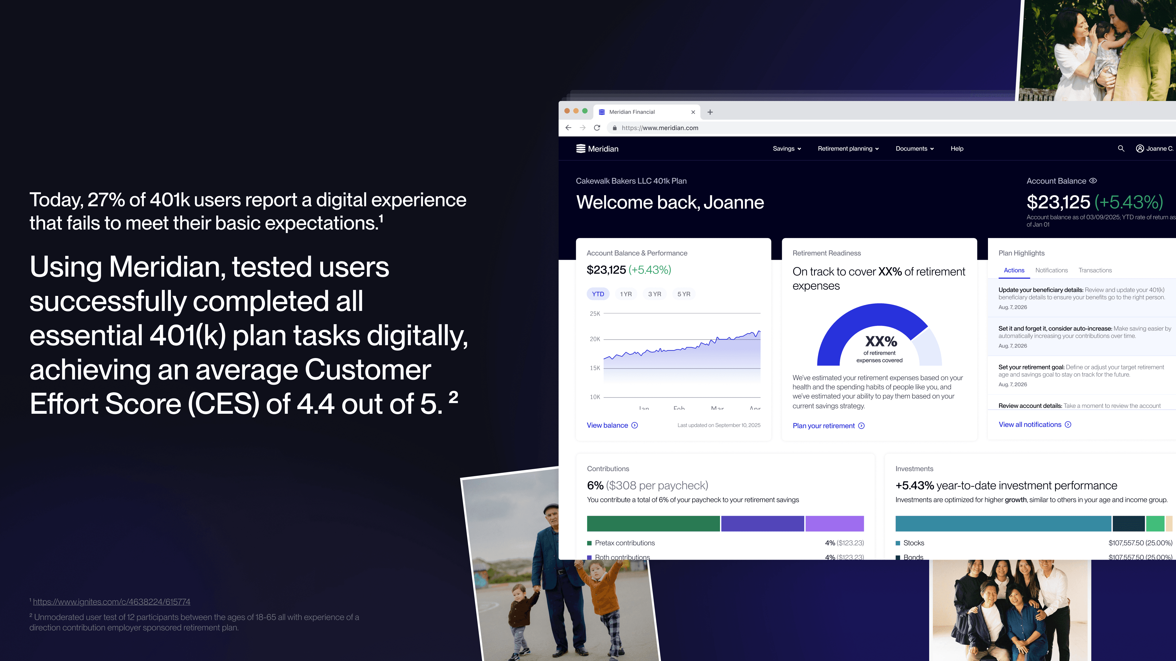
- 4.4 / 5.0Average Customer Effort Score across all core 401k plan tasks
Takeaways
Design-led product transformation
Being the first movers comes with scaling challenges
Design was the first mover in a larger product transformation effort, so early on, our team defined much of how the project operated and who was included. As the transformation scaled and new teams onboarded, that model didn’t stretch to absorb them, and we started rehashing product decisions made earlier in the engagement. We eventually pushed for end-to-end ownership of experience epics like enrollment, giving each one a single champion who represented the product and design intent as new teams came on board. Next time, I’d build that ownership model in from the start.
There aren’t established working norms between design and it’s operational implications
Design and engineering have established norms for working together. We had processes to assess technical feasibility and bring design quality assurance from day one. As our designs matured, I realized we didn’t have the same working model with operational teams. Our designs needed to integrate with investment advisors, customer service reps, and rollover specialists, among others but we had no equivalent process for defining those operational solutions alongside the design work. Our end-to-end champions absorbed some of this, but the gap was large enough that we raised it at a Steering Committee call, which led to standing up an operations pod to coordinate across those stakeholder groups.